
Menu
Unifying multi-membership access
Unifying multi-membership access
A unified experience for managing multiple Priority Pass memberships through one account and a single login.
Redesign the pre-booking flow to move from a “lounge directory” to a “guaranteed access” service.
Redesign the pre-booking flow to move from a “lounge directory” to a “guaranteed access” service.


SCOPE/TEAM
Product Manager, Developers, QA Engineers
Product Manager,
Developers, Marketers
ROLE & CONTRIBUTIONS
End-to-end UX/UI, user flows, interaction states, developer handoff and A/B Testing
TIMELINE
2 months
SCOPE/TEAM
Product Manager, Developers, QA Engineers
ROLE & CONTRIBUTIONS
End-to-end UX/UI, user flows, interaction states, developer handoff and A/B Testing
TIMELINE
2 months
TL;DR
Reimagined Priority Pass's membership experience by transforming a one-account-one-membership product into a scalable multi-membership platform, enabling members to seamlessly manage multiple memberships within a single account.
Simplified lounge access by making membership switching seamless.
Enabled the migration of 4 major EMEA clients to the new platform.
Designed a reusable activation and error-handling framework covering edge case states
https://milelion.com/2026/09/05/new-priority-pass-app-manage-multiple-memberships-improved-lounge-directory-and-more/#comments
TL;DR
Reimagined Priority Pass's membership experience by transforming a one-account-one-membership product into a scalable multi-membership platform, enabling members to seamlessly manage multiple memberships within a single account.
Simplified lounge access by making membership switching seamless.
Enabled the migration of 4 major EMEA clients to the new platform.
Designed a reusable activation and error-handling framework covering edge case states
https://milelion.com/2026/09/05/new-priority-pass-app-manage-multiple-memberships-improved-lounge-directory-and-more/#comments
SOLUTION
Here are some of the key flows
Easy switch of memberships
Reimagined Priority Pass's membership experience by transforming a one-account-one-membership product into a scalable multi-membership platform, enabling members to seamlessly manage multiple memberships within a single account.
Card design addressing brand and user requirements
Reimagined Priority Pass's membership experience by transforming a one-account-one-membership product into a scalable multi-membership platform, enabling members to seamlessly manage multiple memberships within a single account.
Easily add new or existing memberships
Architected the UX for a 1-to-many membership model, unblocking large-scale client onboarding across the EMEA region.
SOLUTION
Here are some of the key flows
Easy switch of memberships
Reimagined Priority Pass's membership experience by transforming a one-account-one-membership product into a scalable multi-membership platform, enabling members to seamlessly manage multiple memberships within a single account.
Card design addressing brand and user requirements
Reimagined Priority Pass's membership experience by transforming a one-account-one-membership product into a scalable multi-membership platform, enabling members to seamlessly manage multiple memberships within a single account.
Easily add new or existing memberships
Architected the UX for a 1-to-many membership model, unblocking large-scale client onboarding across the EMEA region.
OVERVIEW
Powering seamless travel experiences
Priority Pass partners with leading financial institutions and travel brands to provide airport lounge access and travel experiences to millions of members worldwide. As its partner network and membership offerings grew, the product needed to evolve to support increasingly complex membership journeys.

40 million members
Lounges in over 40 airports
OVERVIEW
Powering seamless travel experiences
Priority Pass partners with leading financial institutions and travel brands to provide airport lounge access and travel experiences to millions of members worldwide. As its partner network and membership offerings grew, the product needed to evolve to support increasingly complex membership journeys.
40 million members
Lounges in over 40 airports
PROBLEM
Sign out. Sign back in. Repeat.
Users with multiple Priority Pass memberships had no way to access them from a single account. Each membership required a separate login — meaning users were forced to sign out and back in at the point of entry, often while standing at a lounge door.



PROBLEM
Sign out. Sign back in. Repeat.
Users with multiple Priority Pass memberships had no way to access them from a single account. Each membership required a separate login — meaning users were forced to sign out and back in at the point of entry, often while standing at a lounge door.
HOW MIGHT WE…
USER
How might we make it effortless for members to access the right membership so they're never scrambling at the lounge door?
BUSINESS
How might we build a membership architecture that scales across clients and benefit providers, without compromising entitlement accuracy?
HOW MIGHT WE…
USER
How might we make it effortless for members to access the right membership so they're never scrambling at the lounge door?
BUSINESS
How might we build a membership architecture that scales across clients and benefit providers, without compromising entitlement accuracy?
DESIGN PROCESS
Mapping app impact and user stories
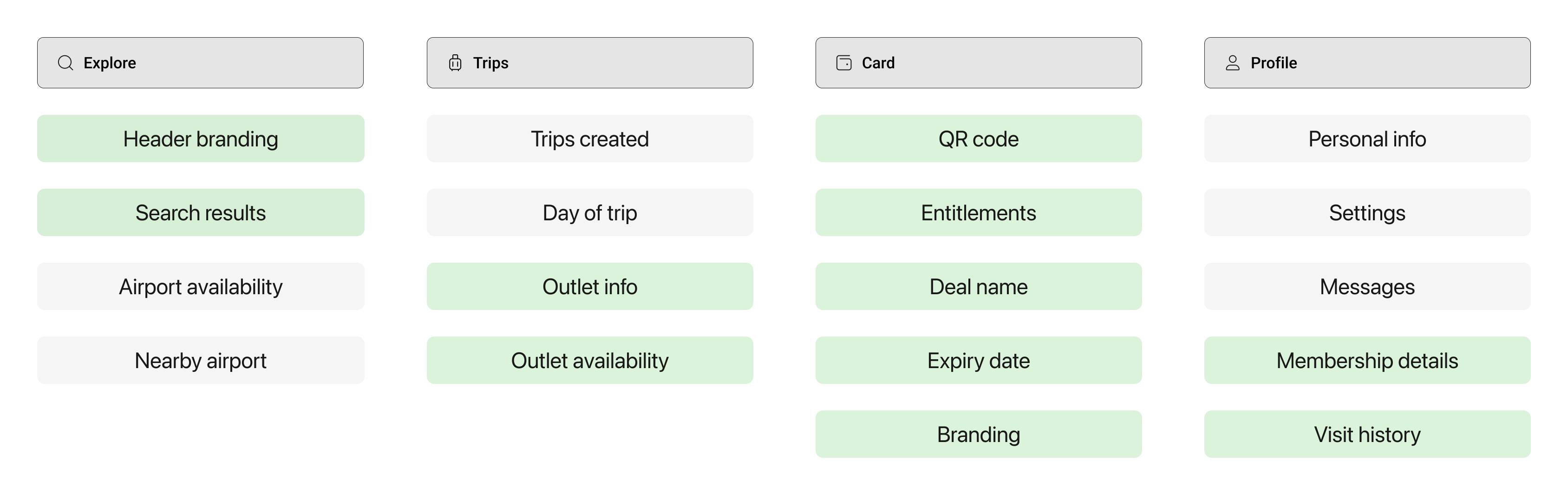
Before touching any UI, I mapped every area of the app that would be affected by multi-membership. Some areas are account-level identical regardless of which membership is active. Others are membership-level dynamically scoped to the selected membership. Getting this boundary right informed every design decision downstream.
Dependent on membership
DESIGN PROCESS
Mapping app impact and user stories
Before touching any UI, I mapped every area of the app that would be affected by multi-membership. Some areas are account-level identical regardless of which membership is active. Others are membership-level dynamically scoped to the selected membership. Getting this boundary right informed every design decision downstream.
Dependent on membership
Exploring how users select their membership
With multiple memberships in one account, I needed to answer two questions: where does switching live, and how do users get a quick overview without cognitive overhead? I explored multiple directions, each testing a different mental model.


Key insight
Users needed the card tab to do two jobs confirm which membership is active at a glance, and surface the QR code fast. The card stack gave the overview; tabs kept access and entitlement info cleanly separated without burying either.
Exploring how users select their membership
With multiple memberships in one account, I needed to answer two questions: where does switching live, and how do users get a quick overview without cognitive overhead? I explored multiple directions, each testing a different mental model.
Key insight
Users needed the card tab to do two jobs confirm which membership is active at a glance, and surface the QR code fast. The card stack gave the overview; tabs kept access and entitlement info cleanly separated without burying either.
DESIGN DECISIONS
Here are some of the key flows
The hardest decisions weren't about what to add they were about what to hold back, and when constraints forced a smarter solution.


A new DS component for quick membership access.
Adding multiple memberships introduced a new persistent action that didn't exist before was add membership. Rather than burying it in settings, we introduced a new CTA directly in the top nav bar. This became a significant update to our design system's navigation pattern
Stacked cards over a flat list
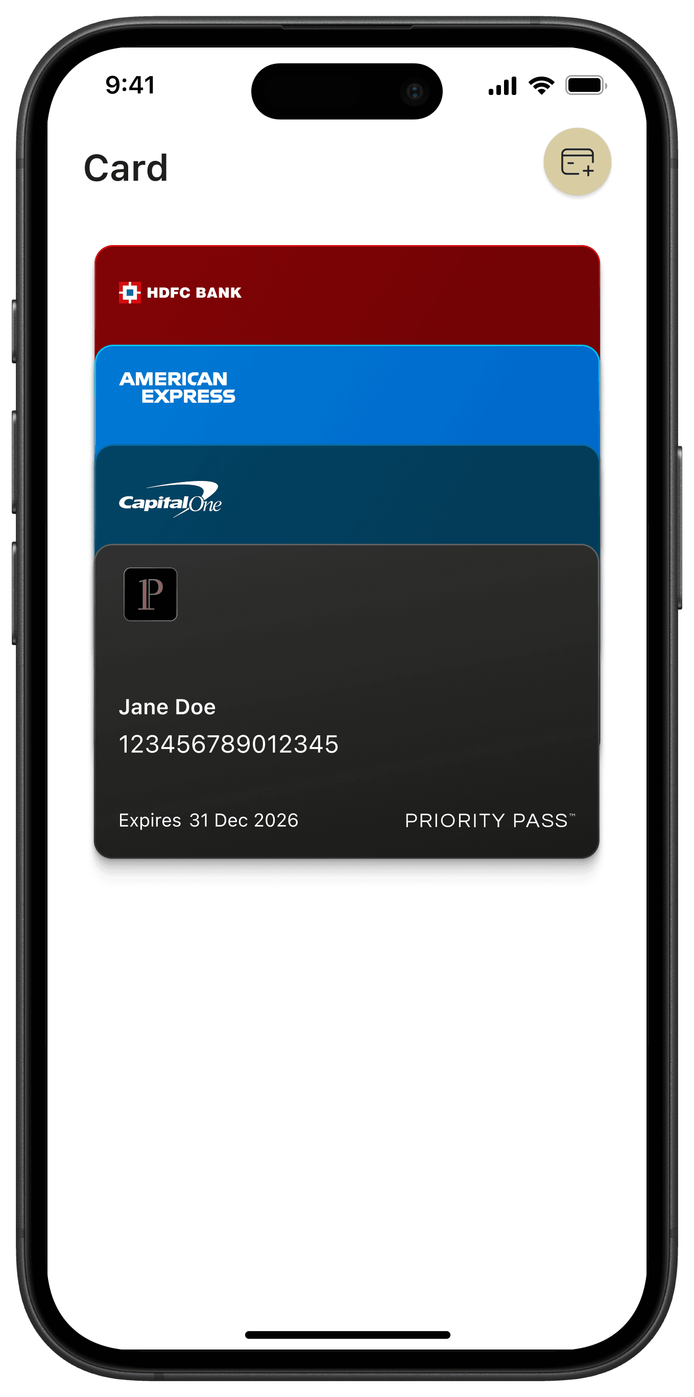
We explored a flat list and a horizontal carousel before testing a stacked card approach. Quick user testing made the winner clear the stack, giving users an immediate sense of how many memberships they held, which was selected, and allowing them to switch with a single tap. It also mapped to an existing mental model from wallet and payment apps.

Communicating zero entitlements without the data
The ideal design surfaced, with remaining entitlement counts directly on each card. However, API limitations meant we couldn't reliably pull live entitlement data at the card stack level. Hence, we opted for a clear 'No entitlements' tag to signal when a membership had zero entitlements remaining.
DESIGN DECISIONS
Here are some of the key flows
The hardest decisions weren't about what to add they were about what to hold back, and when constraints forced a smarter solution.
A new DS component for quick membership access.
Adding multiple memberships introduced a new persistent action that didn't exist before was add membership. Rather than burying it in settings, we introduced a new CTA directly in the top nav bar. This became a significant update to our design system's navigation pattern
Stacked cards over a flat list
We explored a flat list and a horizontal carousel before testing a stacked card approach. Quick user testing made the winner clear the stack, giving users an immediate sense of how many memberships they held, which was selected, and allowing them to switch with a single tap. It also mapped to an existing mental model from wallet and payment apps.
Communicating zero entitlements without the data
The ideal design surfaced, with remaining entitlement counts directly on each card. However, API limitations meant we couldn't reliably pull live entitlement data at the card stack level. Hence, we opted for a clear 'No entitlements' tag to signal when a membership had zero entitlements remaining.
OUTCOMES
How we measured success
Outcomes were tracked through product analytics on membership activation flows, support ticket categorisation against a pre-launch baseline, and an internal client onboarding dashboard monitoring the EMEA migration.
60%+
Of users activated the feature
within 2 months of launch
↓ 30%
Drop in account-related
support contacts
4
Major EMEA clients migrated to the new platform

OUTCOMES
How we measured success
Outcomes were tracked through product analytics on membership activation flows, support ticket categorisation against a pre-launch baseline, and an internal client onboarding dashboard monitoring the EMEA migration.
60%+
Of users activated the feature
within 2 months of launch
↓ 30%
Drop in account-related
support contacts
4
Major EMEA clients migrated to the new platform
REFLECTION
My key takeaways and learnings
Think in systems, not screens
Mapping every flow multi-membership touched before any UI exploration surfaced interdependencies early and prevented costly rework down the line. Systems thinking upstream is what separates a good solution from one that actually ships cleanly.
Constraints can make the design more honest
API limitations meant we couldn't show live entitlement counts on the card stack. Rather than approximate or hide the gap, we designed around it a clear zero state that set accurate expectations
Curious to know more?
This is just a small part of the project get in touch to know more.
REFLECTION
My key takeaways and learnings
Think in systems, not screens
Mapping every flow multi-membership touched before any UI exploration surfaced interdependencies early and prevented costly rework down the line. Systems thinking upstream is what separates a good solution from one that actually ships cleanly.
Constraints can make the design more honest
API limitations meant we couldn't show live entitlement counts on the card stack. Rather than approximate or hide the gap, we designed around it a clear zero state that set accurate expectations
Curious to know more?
This is just a small part of the project get in touch to know more.